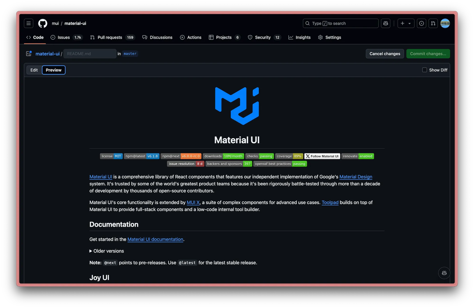
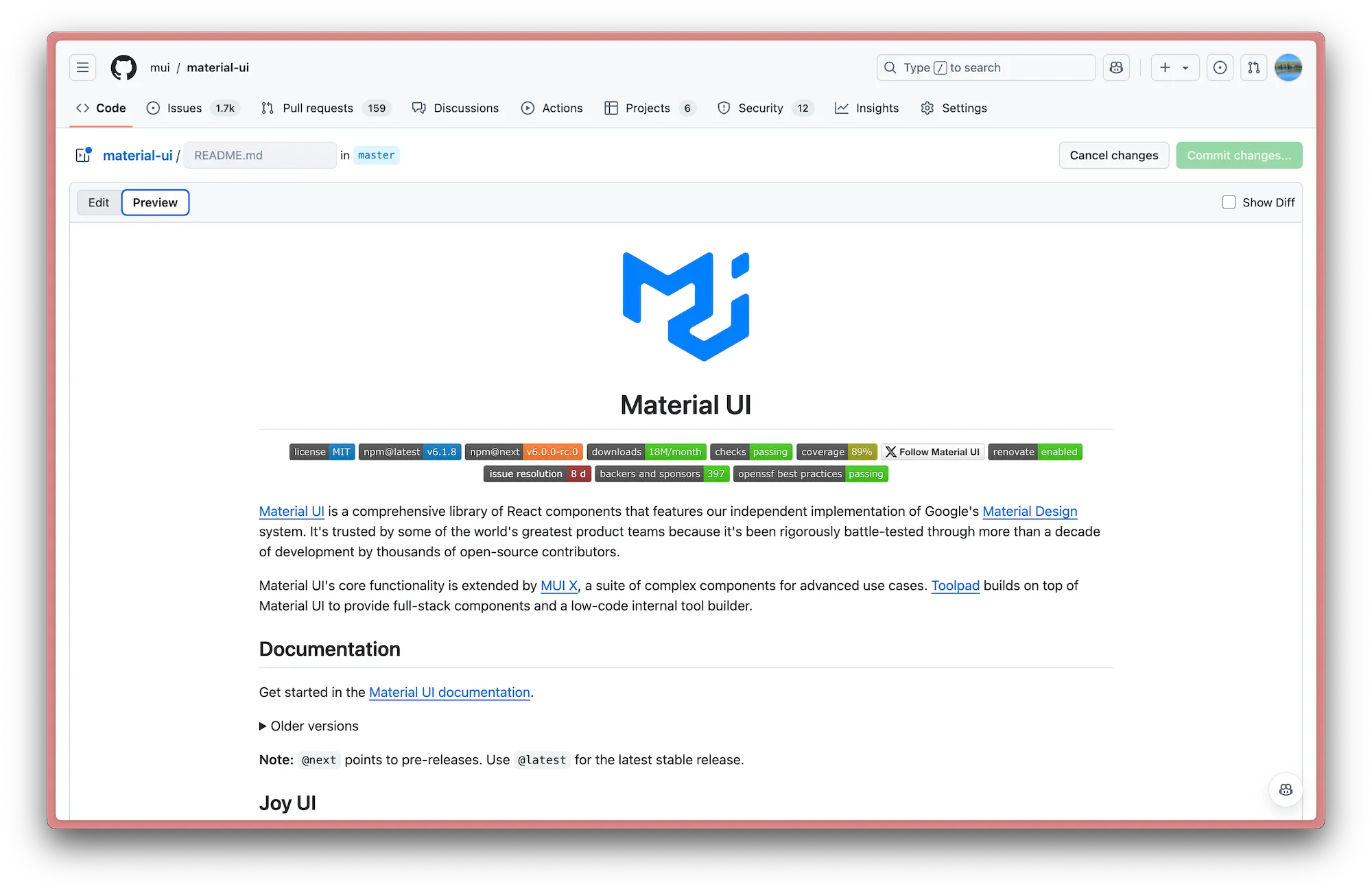
Say you want to beautify a GitHub repo readme file by adding some images—for example, company logos. How do you account for both light- and dark-mode users? Images that look great in one mode might be completely illegible in another. We can use the Material UI readme to illustrate the problem.
Basic images
In the case of the Material UI doc, we’ve got the MUI logo at the top:

<img
  width="150"
  height="133"
  src="https://mui.com/static/logo.svg"
  alt="Material UI logo"
/>
This is simple enough—the logo (intentionally) uses a cool blue color that looks great on both light and dark backgrounds.

But if we take the same approach with the GitHub logo at the bottom, it disappears almost completely in dark mode:


Not great! 😵
Light and dark mode images
To solve this issue, GitHub introduced a way to specify the theme an image is shown to.
This solution uses the HTML <picture> tag in conjunction with the prefers-color-scheme media feature.
So for the GitHub logo, we can give it one image with light text, and another with dark text, and then let the code sort it out based on the user’s preference:
<picture>
  <source
    media="(prefers-color-scheme: dark)"
    srcset="https://mui.com/static/readme/github-darkmode.svg"
  />
  <source
    media="(prefers-color-scheme: light)"
    srcset="https://mui.com/static/readme/github-lightmode.svg"
  />
  <img
    alt="GitHub logo"
    src="https://mui.com/static/readme/github-lightmode.svg"
    width="80"
    height="43"
  />
</picture>
Now when we switch from light to dark mode, the logo changes accordingly:

Pretty neat, right? It’s a small detail but it definitely makes a big difference.
💡 Before the introduction of the
<picture>tag, GitHub used to let you specify themes for images using the fragments#gh-dark-mode-onlyand#gh-light-mode-only. These have since been deprecated and should no longer be used.